
2025
Booking portal form CRO redesign
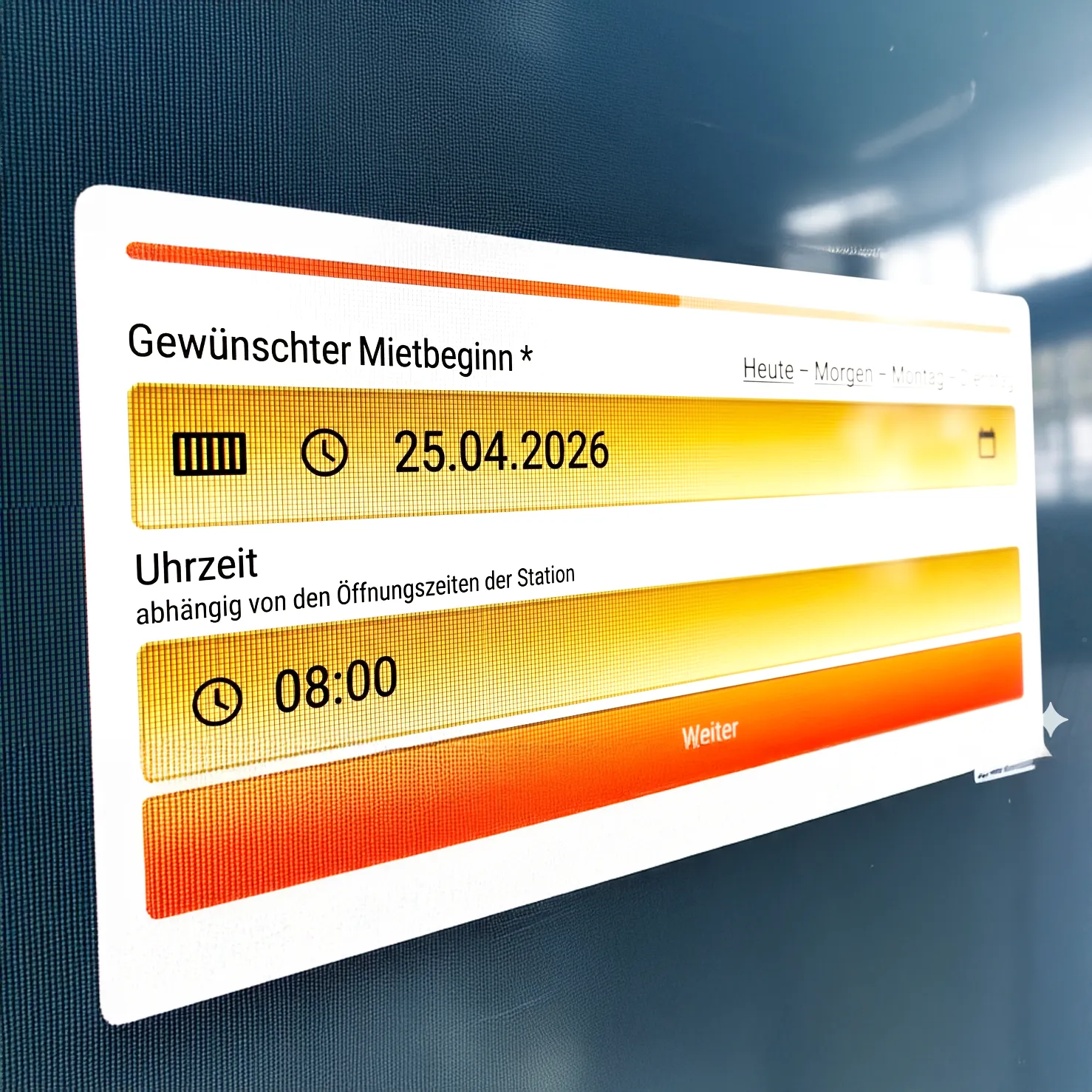
I updated a rental chain's online booking form which, already a decade old, was showing a large number of form fields one after another.
I broke the form up into a multi-page wizard, which, with its large UI components and clear layout, makes it easier to follow the booking process. Also, the overall process feels much faster, dissuading users from bailing out in the middle of the process.
The results were fantastic — conversions (the number of form submissions after opening) rose by 33% and have stayed at that level ever since.